Customizing Image Position
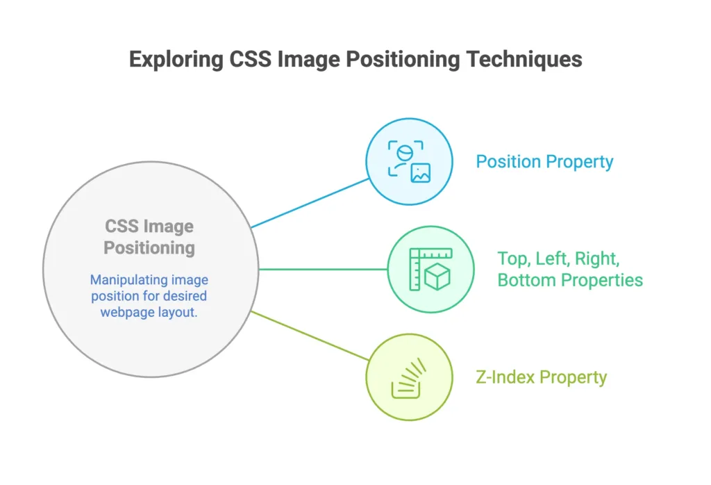
Customizing image position in CSS involves controlling the placement and alignment of images within their containers. This allows you to create visually appealing layouts and designs.

Basics
Basic Positioning
Use the 'position' property to set the positioning method for images, such as 'relative', 'absolute', or 'fixed'.
					/* Basic image positioning */
img {
  position: relative;
  top: 20px;
  left: 30px;
}
Float for Text Wrapping
Float images to the left or right to allow text to wrap around them.
					/* Float image to the right */
img {
  float: right;
  margin: 0 0 10px 10px;
}
Intermediate Usage
Flexbox for Centering
Utilize Flexbox to easily center images both horizontally and vertically.
					/* Center image with Flexbox */
.container {
  display: flex;
  justify-content: center;
  align-items: center;
}
Grid Layout for Precise Placement
Use CSS Grid to create complex layouts and precisely position images.
					/* Grid layout with image placement */
.container {
  display: grid;
  grid-template-columns: 1fr 1fr 1fr;
}

img {
  grid-column: 2 / 3;
  grid-row: 1 / 2;
}
Advanced Techniques
Transforms for 3D Positioning
Apply 3D transforms for more advanced positioning, rotation, and scaling.
					/* 3D transformation for image */
img {
  transform: translate(50px, 20px) rotate(20deg) scale(1.2);
}
Positioning with Grid Areas
Use named grid areas to position images within a grid layout more intuitively.
					/* Grid layout with named areas for image positioning */
.container {
  display: grid;
  grid-template-areas:
    "header header header"
    "main main sidebar"
    "footer footer footer";
}

img {
  grid-area: main;
}
Sticky Image Positioning
Make an image stick to a specific position while scrolling.
					/* Sticky image positioning */
img {
  position: sticky;
  top: 10px; /* Adjust as needed */
}
Transform-Origin for Rotation Point
Specify the rotation point for transformed images using 'transform-origin'.
					/* Transform-origin for rotation point */
img {
  transform: rotate(45deg);
  transform-origin: top left;
}
Considerations
Responsive Positioning
Ensure your image positioning styles adapt to different screen sizes for a responsive design.
					/* Responsive image positioning */
img {
  max-width: 100%;
  height: auto;
}
Accessibility
Consider accessibility by providing alternative text for images using the alt attribute.
<img data-lazyloaded="1" src="data:image/gif;base64,R0lGODdhAQABAPAAAMPDwwAAACwAAAAAAQABAAACAkQBADs=" decoding="async" data-src="image.jpg" alt="Description of the image" title="Customizing Image Position 2">
Practical Use Cases
Image Gallery with Masonry Layout
Create an image gallery with a masonry layout for a dynamic and visually interesting design.
<div class="masonry-gallery">
  <img data-lazyloaded="1" src="data:image/gif;base64,R0lGODdhAQABAPAAAMPDwwAAACwAAAAAAQABAAACAkQBADs=" decoding="async" data-src="image1.jpg" alt="Image 1" title="Customizing Image Position 3">

</div>
					/* CSS for Masonry Layout */
.masonry-gallery {
  display: grid;
  grid-template-columns: repeat(auto-fill, minmax(200px, 1fr));
  gap: 10px;
}
Overlapping Images with Z-Index
Overlap images using the 'z-index' property for a layered effect.
					/* Overlapping images with z-index */
img {
  position: absolute;
  top: 0;
  left: 0;
  z-index: 1;
}

img.overlay {
  position: absolute;
  top: 20px;
  left: 20px;
  z-index: 2;
}
Dynamic Image Positioning on Scroll
Dynamically adjust image positions based on scroll position for a captivating effect.
					/* Dynamic image positioning on scroll */
.img-container {
  position: relative;
}

.img-container img {
  transition: transform 0.3s ease-in-out;
}

.img-container:hover img {
  transform: translateY(-20px);
}
Customizing image position in CSS allows you to have fine control over the layout and visual presentation of your website. From basic positioning and floats to advanced techniques like 3D transforms and grid layouts, the options are vast. Happy Coding! ❤️
