Controlling Image Display
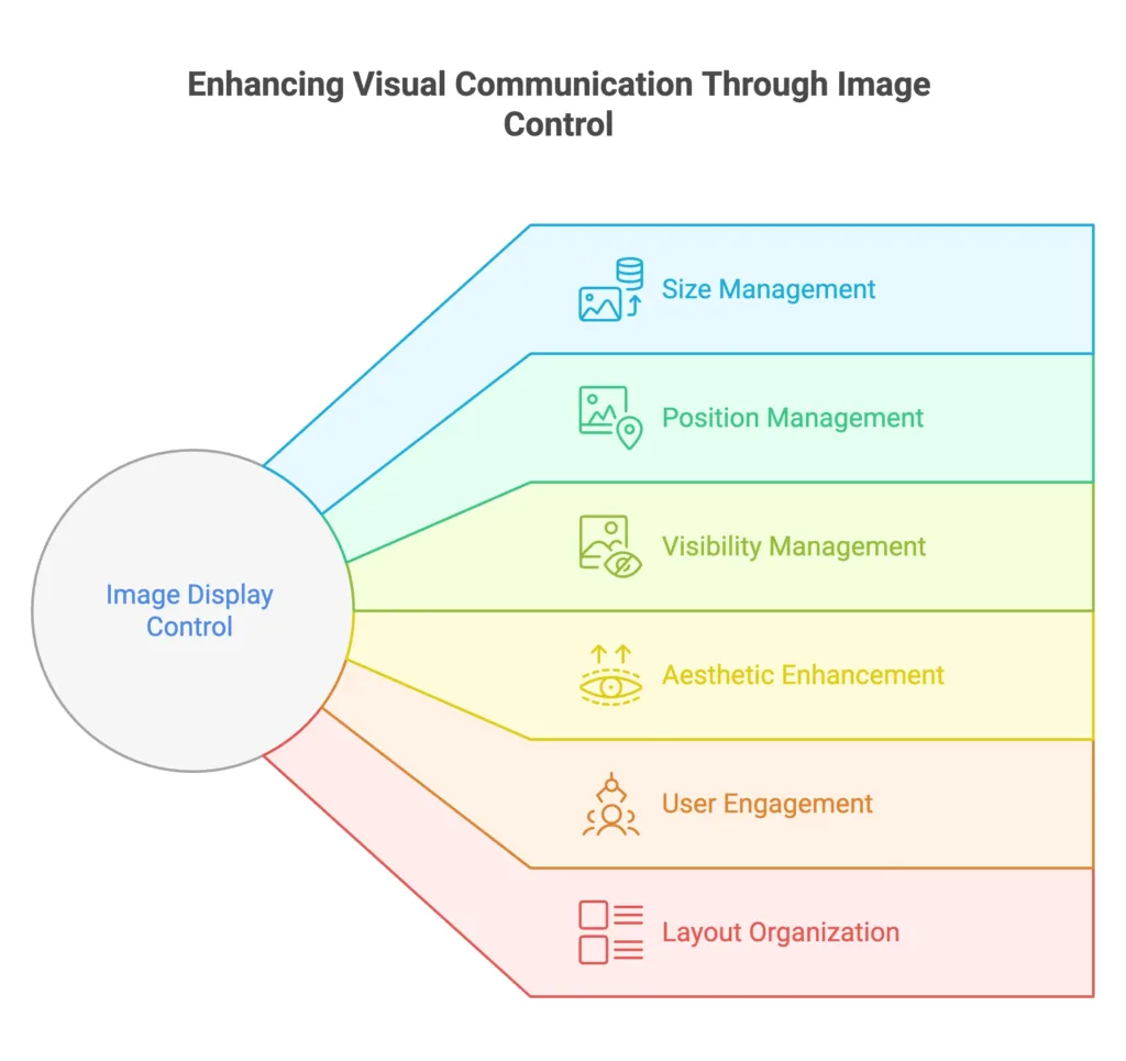
Controlling image display in CSS involves managing the size, alignment, and visibility of images on a web page. This allows for better integration of images into the overall design.

Basics
Image Sizing
Set the size of images using the 'width' and 'height' properties.
					/* Set image width and height */
img {
  width: 300px;
  height: 200px;
}
Responsive Images
Make images responsive by using the 'max-width: 100%;' property to ensure they scale according to the container.
					/* Make images responsive */
img {
  max-width: 100%;
  height: auto;
}
Intermediate Usage
Image Alignment
Align images horizontally or vertically within their container.
					/* Center-align images */
img {
  display: block;
  margin: 0 auto;
}
Image Floating
Float images to the left or right to allow text to wrap around them.
					/* Float image to the right */
img {
  float: right;
  margin: 0 0 10px 10px;
}
Advanced Techniques
Image Opacity
Adjust the opacity of images for transparent effects.
					/* Set image opacity */
img {
  opacity: 0.7;
}
Image Visibility
Control the visibility of images using the 'visibility' property.
					/* Hide image */
img.hidden {
  visibility: hidden;
}
Image Positioning
Use the 'position' property to precisely position images within their containing elements.
					/* Absolute positioning for image */
img {
  position: absolute;
  top: 10px;
  left: 20px;
}
Image Masks
Apply masks to images for creative shapes and patterns.
					/* Image with mask */
img {
  mask-image: url('mask-pattern.png');
  mask-size: cover;
}
Clipping Paths
Use clipping paths to create intricate shapes for images.
					/* Image with custom clipping path */
img {
  clip-path: polygon(50% 0%, 0% 100%, 100% 100%);
}
Image Filters
Apply CSS filters to images for effects like brightness, contrast, and saturation.
					/* Image with filters */
img {
  filter: brightness(1.2) contrast(1.2) saturate(1.5);
}
Blend Modes
Use blend modes to control how images blend with their background.
					/* Image with blend mode */
img {
  mix-blend-mode: multiply;
}
Cross-fading Images
Create smooth cross-fades between two images for a seamless transition effect.
					/* Cross-fade effect */
img {
  transition: opacity 0.5s ease-in-out;
}

img:hover {
  opacity: 0;
}
Considerations
Aspect Ratio Preservation
Preserve the aspect ratio of images while controlling their display to avoid distortion.
					/* Preserve aspect ratio */
.img-container {
  position: relative;
  width: 100%;
  padding-bottom: 75%; /* Adjust to desired aspect ratio */
}

.img-container img {
  position: absolute;
  width: 100%;
  height: 100%;
}
Lazy Loading
Implement lazy loading for images to optimize page loading performance.
					/* Lazy loading for images */
img {
  loading: lazy;
}
High-DPI Images for Retina Displays
Provide high-resolution images for devices with high pixel density.
					/* High-DPI image optimization */
@media only screen and (min-resolution: 192dpi) {
  img {
    background-image: url('high-res-image.jpg');
    background-size: cover;
  }
}
Cross-browser Compatibility
Ensure that your image display styles are compatible with various browsers.
					/* Browser-specific prefixes for image display */
img {
  display: -webkit-box; /* Safari and Chrome */
  display: -moz-box; /* Firefox */
  display: -ms-flexbox; /* Internet Explorer */
  display: -webkit-flex; /* Old Safari */
  display: flex;
}
Practical Use Cases
Image Grids with Hover Effects
Create image grids with dynamic hover effects for a visually engaging gallery.
<div class="image-grid">
  <div class="grid-item">
    <img data-lazyloaded="1" src="data:image/gif;base64,R0lGODdhAQABAPAAAMPDwwAAACwAAAAAAQABAAACAkQBADs=" decoding="async" data-src="image1.jpg" alt="Image 1" class="hover-effect" title="Controlling Image Display 2">
  </div>

</div>
					/* CSS */
.image-grid .hover-effect {
  transition: transform 0.3s ease-in-out;
}

.image-grid .grid-item:hover .hover-effect {
  transform: scale(1.1);
}
Circular Images
Clip images into circular shapes using the 'border-radius' property.
					/* Circular image */
.circular-image {
  border-radius: 50%;
  overflow: hidden;
}
Image Captions on Hover
Display captions on image hover using the '::after' pseudo-element.
					/* Image caption on hover */
.image-container {
  position: relative;
}

.image-container:hover::after {
  content: "Image Caption";
  position: absolute;
  bottom: 0;
  left: 0;
  width: 100%;
  background: rgba(0, 0, 0, 0.7);
  color: #fff;
  padding: 10px;
  text-align: center;
}
Background Image Parallax Effect
Implement a parallax effect using background images for a dynamic scrolling experience.
<section class="parallax-section">
  <div class="parallax-image"></div>
</section>
					/* Parallax effect with background image */
.parallax-section {
  height: 500px;
  overflow: hidden;
}

.parallax-image {
  background-image: url('parallax-image.jpg');
  height: 100%;
  background-size: cover;
  transform: translateZ(0);
  transition: transform 0.5s ease-in-out;
}

.parallax-section:hover .parallax-image {
  transform: translateY(-20px);
}
Image Zoom on Click
Allow users to zoom in on images when clicked for a closer view.
					/* Image zoom on click */
img {
  transition: transform 0.3s ease-in-out;
}

img:active {
  transform: scale(1.2);
}
Controlling image display in CSS is crucial for achieving a visually appealing and well-integrated design. From basic sizing and alignment to advanced techniques like opacity and visibility, these tools provide a comprehensive approach to managing images on your web page. Happy Coding! ❤️
