Understanding the Box Model
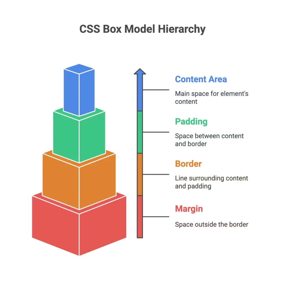
The Box Model is a fundamental concept in CSS that defines how elements are rendered on a webpage. It consists of content, padding, border, and margin.
Basic Understanding

Components of the Box Model
- Content: The actual content of the element.
- Padding: Space between the content and the border.
- Border: A border surrounding the padding (if any).
- Margin: Space outside the border, separating the element from other elements.
Diagram
					+-------------------------------------------+
|                Margin                     |
|   +-----------------------------+         |
|   |            Border           |         |
|   |   +---------------------+   |         |
|   |   |        Padding      |   |         |
|   |   |  +----------------+ |   |         |
|   |   |  |     Content    | |   |         |
|   |   |  +----------------+ |   |         |
|   |   +---------------------+   |         |
|   +-----------------------------+         |
+-------------------------------------------+
Basic Examples
Example 1: Setting Width and Height
					   .box {
      width: 200px;
      height: 100px;
      border: 2px solid #3498db;
      padding: 20px;
      margin: 10px;
   }
Example 2: Box Model Shorthand
					   .shorthand-box {
      width: 300px;
      padding: 10px;
      margin: 20px;
      border: 1px solid #e74c3c;
   }
Intermediate Concepts
Box Sizing Property
'content-box'(default): Width and height only include the content.'border-box': Width and height include content, padding, and border.
					.border-box-example {
   box-sizing: border-box;
   width: 200px;
   padding: 20px;
   border: 2px solid #27ae60;
}
Box Sizing Property
Use percentage values for width and height, as well as
'auto'for automatic sizing.
					.percentage-box {
   width: 50%;
   height: auto;
}
Advanced Techniques
Nested Box Model
Understanding how the box model works in nested elements is crucial for complex layouts.
<div class="parent">
   <div class="child">

   </div>
</div>
					/* CSS */

.parent {
   padding: 20px;
}

.child {
   margin: 10px;
   border: 1px solid #f39c12;
}
Calc() Function
Use
'calc()'for precise calculations in box model properties.
					.calc-box {
   width: calc(50% - 20px);
}
Practical Examples
Card with Box Model
Apply the box model to create a simple card component.
					.card {
   width: 300px;
   padding: 15px;
   border: 1px solid #34495e;
   margin: 10px;
}
Responsive Box Model
Utilize percentage values for a responsive and fluid layout.
					.responsive-box {
   width: 80%;
   padding: 5%;
   border: 2px solid #e67e22;
}
Understanding the Box Model is foundational for mastering CSS layout and design. The ability to manipulate content, padding, border, and margin empowers you to create visually appealing and well-structured web pages. Happy coding! ❤️
