Playing with Padding
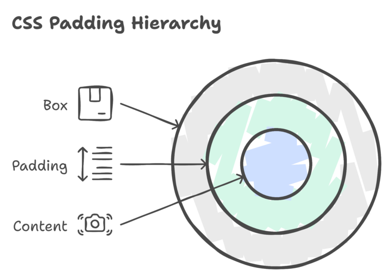
Padding is the space between the content of an element and its border. It provides internal spacing, making the content visually appealing.

Syntax
					selector {
   padding: top right bottom left;
}
top, right, bottom, left: Values for individual sides (in pixels, ems, percentages, etc.) or a single value for all sides.
Basic Examples
Example 1: Padding on All Sides
					   .box {
      padding: 20px;
   }
Example 2: Padding with Individual Values
					   .box {
      padding: 10px 20px 15px 5px;
   }
Intermediate Concepts
Percentage Padding
Padding can also be specified in percentages, relative to the width of the containing element.
					.box {
   padding: 5%;
}
Padding Shorthand
You can use the shorthand notation to set padding for individual sides in a single line.
					.box {
   padding: 10px 20px;
}
Advanced Techniques
Padding and Box Sizing
Consider the 'box-sizing' property when dealing with padding to control the sizing behavior of an element.
					.box {
   box-sizing: border-box;
   padding: 20px;
}
Responsive Padding
Use media queries to apply different padding values based on the screen size.
					@media screen and (max-width: 600px) {
   .box {
      padding: 10px;
   }
}
Padding and Background-Clip
The 'background-clip' property determines how the background of an element should extend. Combining it with padding can create interesting effects.
					.box {
   padding: 20px;
   background-color: #3498db;
   color: #fff;
   background-clip: content-box;
}
Nested Padding
When dealing with nested elements, understanding how padding behaves is crucial. Padding in a parent element affects the positioning of child elements.
					.parent {
   padding: 20px;
}

.child {
   padding: 10px;
}
Negative Padding
Although unconventional, negative padding can be used to visually extend an element beyond its defined boundaries.
					.box {
   padding: 20px;
   margin: -10px;
}
Transition on Padding
Apply smooth transitions to padding changes, creating a polished and interactive user experience.
					.box {
   padding: 10px;
   transition: padding 0.3s ease;
}

.box:hover {
   padding: 20px;
}
Mastering the art of "Playing with Padding" involves exploring not only the basics but also advanced techniques that can elevate your design and layout skills. By understanding how padding interacts with other properties and experimenting with practical examples, you'll be well-prepared to tackle diverse challenges in web development. Happy Coding! ❤️
