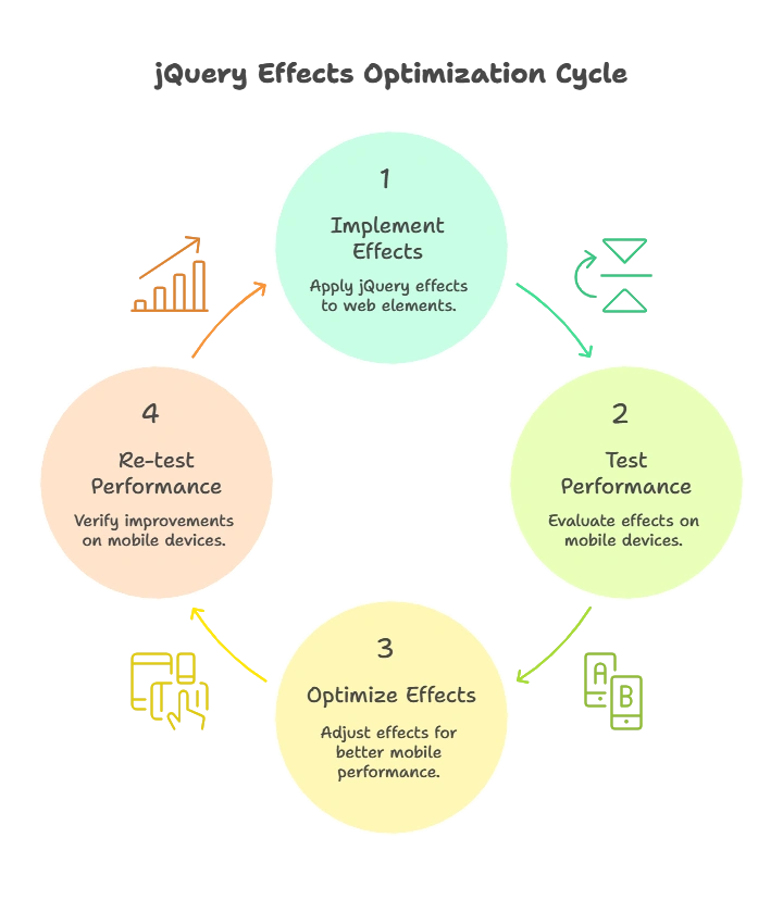
Adapting jQuery Effects for Mobile
In today’s mobile-first world, ensuring that jQuery effects work efficiently and smoothly on mobile devices is critical. Mobile devices come with different screen sizes, processing power, and touch-based interaction methods. Thus, the way you implement and optimize jQuery effects for desktop might not translate well to mobile devices. In this chapter, we will explore how to adapt jQuery effects for mobile, from basic to advanced techniques.
Introduction to jQuery Effects
jQuery effects like fadeIn(), slideUp(), animate(), and others are widely used to create dynamic and interactive web applications. These effects are particularly useful for improving user experience, providing visual feedback, and guiding users’ attention.
However, these effects, if not optimized, can lead to poor performance on mobile devices due to limited processing power and different interaction paradigms.

Why Mobile-Specific Optimization is Necessary
Mobile devices differ from desktop computers in several key areas:
- Limited Processing Power: Mobile devices often have less powerful CPUs and GPUs.
- Touch Interaction: Unlike desktops, which rely on mouse events, mobile devices use touch events, which change how users interact with elements.
- Battery Life: Intensive animations can drain the battery faster, so efficiency is important.
- Screen Size: Smaller screen sizes mean that some animations and effects might need adjustments to fit correctly on mobile.
Optimizing jQuery effects for mobile is necessary to ensure a smooth, responsive experience for users across devices.
Basic jQuery Effects and Their Mobile Considerations
Hide and Show
The hide() and show() methods are among the most basic jQuery effects. On mobile, you might need to use these effects sparingly to avoid unnecessary repaints and reflows.
Example:
					<button id="toggleButton">Toggle</button>
<div id="box">This is a box.</div> <script type="litespeed/javascript">$('#toggleButton').on('click',function(){$('#box').toggle()})</script>
Explanation:
- The
toggle()function hides or shows the element when the button is clicked. - On mobile, consider the performance of toggling large elements as it can impact responsiveness.
Output: The #box element will be shown or hidden when the “Toggle” button is clicked.
Fade Effects
Fading elements in and out using fadeIn() and fadeOut() is a popular visual effect. However, fade effects can be sluggish on mobile devices if not optimized.
Example:
					<button id="fadeButton">Fade</button>
<div id="contentBox">Content to fade in or out.</div> <script type="litespeed/javascript">$('#fadeButton').on('click',function(){$('#contentBox').fadeToggle(500)})</script>
Explanation:
- The
fadeToggle()method is used to alternate between fading in and fading out. - For mobile, reducing the speed (here set to
500ms) can improve performance and responsiveness.
Output: The #contentBox will fade in and out when the “Fade” button is clicked.
Slide Effects
Sliding content is another common effect, especially useful for expanding and collapsing content.
Example:
					<button id="slideButton">Slide</button>
<div id="menu">This is a sliding menu.</div> <script type="litespeed/javascript">$('#slideButton').on('click',function(){$('#menu').slideToggle(300)})</script>
Explanation:
- The
slideToggle()method either slides the element up or down. - For mobile, keeping the animation short (300ms) ensures smoother performance.
Output: Clicking the button will slide the #menu element up or down.
Advanced Mobile-Specific jQuery Effects
Touch-Based Effects
When adapting jQuery effects for mobile, touch-based interactions are critical. Gestures like swipe, pinch, and long press are common on mobile devices and should be accounted for.
Example (Swipe to Hide):
<script type="litespeed/javascript">$('#swipeElement').on('touchstart',function(e){let startX=e.originalEvent.touches[0].pageX;$(this).on('touchmove',function(e){let moveX=e.originalEvent.touches[0].pageX;if(startX-moveX>50){$(this).fadeOut()}})})</script>
Explanation:
- The
touchstartandtouchmoveevents are used to detect a swipe gesture. - If the user swipes left, the element fades out.
- This effect is mobile-specific and enables intuitive touch interactions.
Output: Swiping left on the element will cause it to fade out.
CSS3 Transitions and Animations with jQuery
Instead of relying purely on jQuery for animations, you can use CSS3 transitions for mobile optimization. CSS3 transitions are hardware-accelerated, making them more efficient for mobile devices.
Example (Using CSS3 with jQuery):
					#box {
  transition: transform 0.5s;
}
<script type="litespeed/javascript">$('#moveButton').on('click',function(){$('#box').css('transform','translateX(100px)')})</script>
Explanation:
- The
transformproperty in CSS3 is used to move the element, and it’s applied using jQuery’s.css()method. - CSS3 transitions are smoother on mobile because they leverage hardware acceleration.
Output: Clicking the button will move the box 100px to the right.
Performance Optimization for Mobile
Reducing DOM Manipulation
Minimizing DOM manipulation on mobile is key to performance. Frequent DOM manipulations can cause lag, particularly on less powerful devices. Always try to batch updates or manipulate the DOM outside of intensive loops.
Example:
					<script type="litespeed/javascript">var content='';for(var i=0;i<100;i++){content+='<p>Item '+i+'</p>'}
$('#container').html(content)</script>
Explanation:
- Instead of adding 100 elements one by one to the DOM, we concatenate the HTML in a string and then update the DOM in one go. This reduces reflows and repaints, which are costly on mobile devices.
Throttle and Debounce for Mobile
Frequent events like scrolling or resizing can trigger performance issues on mobile. Using throttle and debounce techniques limits the frequency at which these events are handled.
Example (Debounce):
					function debounce(fn, delay) {
  let timer;
  return function() {
    clearTimeout(timer);
    timer = setTimeout(fn, delay);
  };
}

$(window).on('resize', debounce(function() {
  console.log('Resizing');
}, 200));
Explanation:
- The
debounce()function ensures that the resize event is handled only after 200ms of inactivity, reducing unnecessary event triggers.
Hardware Acceleration for Animations
Using CSS properties like transform or opacity triggers hardware acceleration, making animations smoother on mobile.
Touch Event Compatibility with jQuery Effects
For mobile devices, touch events are essential. jQuery provides a way to handle these touch events with ease. You can also use plugins like jQuery Mobile for more advanced touch support.
Example (Touch Event):
<script type="litespeed/javascript">$('#box').on('touchstart',function(){$(this).css('background-color','yellow')})</script>
Explanation:
- This example changes the background color when the user touches the
#boxelement.
Best Practices for jQuery Effects on Mobile
- Optimize Animation Speed: Use faster animations on mobile to ensure smoothness.
- Avoid Heavy DOM Manipulation: Batch DOM updates to prevent performance issues.
- Use CSS3 Transitions: Prefer CSS3 transitions for animations to leverage hardware acceleration.
- Test on Real Devices: Always test jQuery effects on physical mobile devices to ensure they perform as expected.
- Debounce Frequent Events: Use debounce and throttle techniques for events like scroll and resize.
Adapting jQuery effects for mobile is an essential part of modern web development. By optimizing animations, leveraging CSS3, and ensuring smooth touch-based interactions, you can create a seamless user experience on mobile devices. Happy Coding!❤️
