Responsive Event Handling
In modern web development, creating responsive web applications is crucial, especially with the growing variety of devices and screen sizes. Responsive event handling refers to the process of adapting event-based functionalities, such as click, resize, and scroll, to different screen sizes and devices (mobile, tablet, desktop). jQuery provides a robust way to manage event handling that ensures smooth user experiences across all devices.
Introduction to Responsive Event Handling
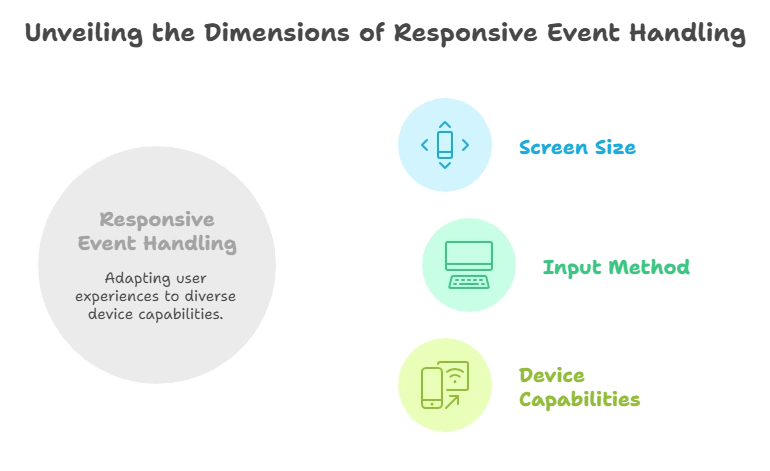
Responsive event handling involves creating user experiences that adapt fluidly to the screen size, input method, and device capabilities. jQuery simplifies this by abstracting cross-browser differences in event handling, allowing developers to focus on functionality without worrying about compatibility issues.

Why Responsive Event Handling Matters
With the wide range of devices—each with different screen sizes and input methods like mouse, keyboard, and touch—it’s essential to ensure that event listeners work consistently across devices. Without proper event handling, your application may behave unexpectedly, leading to a poor user experience.
For example, a click event on a desktop might need to translate into a tap event on a mobile device. Similarly, layouts and elements might need to adjust based on screen size changes (responsive design).
Basic Event Handling in jQuery
Before diving into responsive events, it’s important to cover basic event handling in jQuery. jQuery provides methods like .on() and .off() to handle events such as clicks, keypresses, and form submissions.
Example:
<button id="clickMe">Click Me!</button> <script type="litespeed/javascript">$('#clickMe').on('click',function(){alert('Button clicked!')})</script>
Explanation:
- The
on()method binds a click event to the button with the IDclickMe. - When clicked, an alert displays “Button clicked!”.
Output: Clicking the “Click Me!” button will show an alert.
Responsive Resize Events
Handling the resize event is essential for creating a responsive web application. You need to ensure that the layout or behavior of elements adjusts as the window size changes.
Handling Window Resize
The resize event is triggered when the browser window is resized. You can use this event to dynamically change the layout or behavior of the webpage.
Example:
<script type="litespeed/javascript">$(window).on('resize',function(){var width=$(window).width();if(width<768){$('#content').css('background-color','lightblue')}else{$('#content').css('background-color','lightgreen')}})</script>
Explanation:
- This code listens for the
resizeevent on the window. When the window’s width goes below 768px (a common mobile breakpoint), the background color of the#contentdiv changes to light blue. - For larger screens, it changes to light green.
Output: Resize the window, and the background color of #content will change based on screen width.
Responsive Breakpoints
Breakpoints define specific screen widths at which design changes occur. You can use these breakpoints to trigger specific behaviors.
Example:
<script type="litespeed/javascript">$(window).on('resize',function(){var width=$(window).width();if(width<576){$('#message').text('Small screen')}else if(width<992){$('#message').text('Medium screen')}else{$('#message').text('Large screen')}})</script>
Explanation:
- This example checks the window width at different breakpoints:
576px,992px, and above. - Based on the window width, the text inside the
#messageelement is updated accordingly.
Output: Resize the browser, and the message will change based on screen size (small, medium, large).
Handling Responsive Click and Touch Events
Mobile devices primarily use touch events, so it’s essential to ensure that click events translate well to touch events. jQuery simplifies this by allowing you to bind both click and touch events together.
Click and Touch:
<button id="actionButton">Click or Tap Me!</button> <script type="litespeed/javascript">$('#actionButton').on('click touchstart',function(){alert('Action performed!')})</script>
Explanation:
- The event handler binds both the
clickandtouchstartevents to the same button. - Whether the user clicks or taps the button, the event handler will trigger the alert “Action performed!”.
Output: Whether the user clicks or taps the button, an alert will display.
Media Query Event Listeners
In addition to handling resize events, you can use media queries to conditionally trigger events based on screen size. jQuery doesn’t have built-in support for media queries, but JavaScript’s window.matchMedia() function can be combined with jQuery.
Example:
					<script type="litespeed/javascript">var mediaQuery=window.matchMedia("(max-width: 768px)");function handleMediaChange(e){if(e.matches){$('#responsiveText').text('This is a mobile view')}else{$('#responsiveText').text('This is a desktop view')}}
mediaQuery.addListener(handleMediaChange);handleMediaChange(mediaQuery)</script>
Explanation:
- The
matchMedia()function checks if the screen width is below768px. - The
handleMediaChangefunction changes the text in the#responsiveTextelement based on the screen size. - The
addListener()function listens for media query changes.
Output: As the screen crosses the 768px threshold, the text changes between “This is a mobile view” and “This is a desktop view”.
Throttle and Debounce Techniques for Performance
Handling frequent events like resize and scroll can cause performance issues because they trigger multiple times in a short span. To mitigate this, you can use throttling and debouncing techniques.
- Throttling: Executes the event handler at regular intervals.
- Debouncing: Delays the execution of the event handler until a certain time has passed after the last event.
Debounce Example:
					function debounce(fn, delay) {
  let timer;
  return function() {
    clearTimeout(timer);
    timer = setTimeout(() => fn.apply(this, arguments), delay);
  };
}

$(window).on('resize', debounce(function() {
  console.log('Resize event triggered');
}, 200));
Explanation:
- The
debounce()function delays the execution of the resize event by200msafter the last resize event has been triggered. - This helps in preventing multiple rapid calls, improving performance.
Best Practices for Responsive Event Handling
- Avoid Overusing Events: Handling too many events (like
resize) can cause performance issues. Use debouncing and throttling to minimize the load on the browser. - Optimize for Touch Devices: Combine
clickandtouchevents to ensure compatibility with mobile and tablet devices. - Use Media Queries: Implement media queries not just for CSS but also for JavaScript event handling.
- Test Across Devices: Always test your event handling on various screen sizes and devices to ensure smooth functionality.
- Be Mindful of Performance: Avoid heavy DOM manipulations inside frequently triggered events like scroll or resize.
Responsive event handling is crucial in today’s multi-device web development environment. With jQuery, managing events like clicks, resizes, and touch events can be made seamless and consistent across devices. By using techniques like throttling, debouncing, and media query event listeners, you can optimize performance and ensure your applications provide an excellent user experience on all platforms. Happy Coding!❤️
