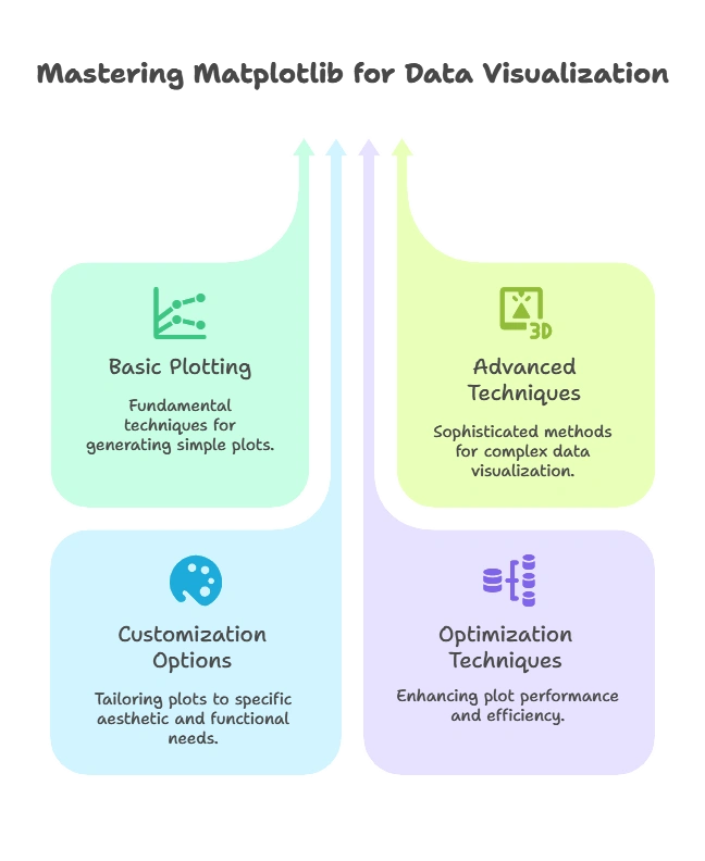
Plotting with Matplotlib
Matplotlib is a powerful library for creating visualizations in Python. In this topic, we'll explore everything you need to know about plotting with Matplotlib, from the basics to advanced techniques. We'll cover various types of plots, customization options, and optimization techniques to create compelling visualizations.

Introduction to Matplotlib
What is Matplotlib?
Matplotlib is a comprehensive library for creating static, animated, and interactive visualizations in Python. It provides a wide range of plotting functions and customization options.
Installing Matplotlib
Before using Matplotlib, you need to install it using pip:
pip install matplotlib
Importing Matplotlib
To use Matplotlib in your Python script, import it as follows:
import matplotlib.pyplot as plt
Basic Plotting Techniques
Line Plot
A line plot is a type of plot where data points are connected by straight line segments.
Example: Creating a Simple Line Plot
					import matplotlib.pyplot as plt

# Data
x = [1, 2, 3, 4, 5]
y = [2, 4, 6, 8, 10]

# Plot
plt.plot(x, y)

# Customize plot
plt.title("Simple Line Plot")
plt.xlabel("X-axis")
plt.ylabel("Y-axis")

# Show plot
plt.show()
Explanation:
- We import Matplotlib’s Pyplot module as
plt. - We define two lists
xandyas data points. - We use
plt.plot()function to create a line plot. - We customize the plot by adding a title, xlabel, and ylabel.
- Finally, we display the plot using
plt.show().
Scatter Plot
A scatter plot is a type of plot where each data point is represented as a marker.
Example: Creating a Simple Scatter Plot
					import matplotlib.pyplot as plt

# Data
x = [1, 2, 3, 4, 5]
y = [2, 4, 6, 8, 10]

# Plot
plt.scatter(x, y)

# Customize plot
plt.title("Simple Scatter Plot")
plt.xlabel("X-axis")
plt.ylabel("Y-axis")

# Show plot
plt.show()
Explanation:
- Similar to the line plot example, we use
plt.scatter()function to create a scatter plot.
Advanced Plotting Techniques
Subplots
Subplots allow you to create multiple plots within the same figure.
Example: Creating Subplots
					import matplotlib.pyplot as plt

# Data
x = [1, 2, 3, 4, 5]
y1 = [2, 4, 6, 8, 10]
y2 = [1, 3, 5, 7, 9]

# Create subplots
plt.figure(figsize=(10, 5))

plt.subplot(1, 2, 1)
plt.plot(x, y1)
plt.title("Subplot 1")

plt.subplot(1, 2, 2)
plt.plot(x, y2)
plt.title("Subplot 2")

# Show plot
plt.show()
Explanation:
- We use
plt.subplot()function to create subplots. - The arguments
(1, 2, 1)and(1, 2, 2)specify the layout of subplots (1 row, 2 columns, and the index of each subplot). - We plot data on each subplot and customize titles.
Customizing Plots
Colors, Markers, and Line Styles
Matplotlib allows customization of colors, markers, and line styles in plots.
Example: Customizing Line Plot
					import matplotlib.pyplot as plt

# Data
x = [1, 2, 3, 4, 5]
y = [2, 4, 6, 8, 10]

# Plot with customized style
plt.plot(x, y, color='red', marker='o', linestyle='--', linewidth=2)

# Customize plot
plt.title("Customized Line Plot")
plt.xlabel("X-axis")
plt.ylabel("Y-axis")

# Show plot
plt.show()
Explanation:
- We use parameters like
color,marker,linestyle, andlinewidthinplt.plot()function to customize the appearance of the plot.
Adding Annotations and Text
Annotations and text can be added to plots to provide additional information.
Example: Adding Annotation to Scatter Plot
					import matplotlib.pyplot as plt

# Data
x = [1, 2, 3, 4, 5]
y = [2, 4, 6, 8, 10]

# Plot
plt.scatter(x, y)

# Add annotation
plt.text(3, 6, "Max Value", fontsize=12, color='blue')

# Customize plot
plt.title("Scatter Plot with Annotation")
plt.xlabel("X-axis")
plt.ylabel("Y-axis")

# Show plot
plt.show()
Explanation:
- We use
plt.text()function to add text to the plot at specified coordinates.
Saving Plots
Saving Plots as Image Files
Matplotlib allows saving plots as image files in various formats like PNG, JPEG, and PDF.
Example: Saving Plot as PNG Image
					import matplotlib.pyplot as plt

# Data
x = [1, 2, 3, 4, 5]
y = [2, 4, 6, 8, 10]

# Plot
plt.scatter(x, y)

# Add annotation
plt.text(3, 6, "Max Value", fontsize=12, color='blue')

# Customize plot
plt.title("Scatter Plot with Annotation")
plt.xlabel("X-axis")
plt.ylabel("Y-axis")

# Show plot
plt.show()
Explanation:
- We use
plt.text()function to add text to the plot at specified coordinates.
We explored the basics of plotting with Matplotlib in Python. We covered line plots, scatter plots, subplots, and more, along with examples and detailed explanations.
Understanding Matplotlib is essential for creating a wide range of visualizations to analyze and present data effectively. With the knowledge gained from this topic, you'll be well-equipped to create compelling plots for your data analysis projects. Happy Coding!❤️
