Data Visualization with Matplotlib and Plotly
Data visualization is a powerful tool for exploring and communicating insights from data. In this topic, we'll dive deep into data visualization using two popular Python libraries: Matplotlib and Plotly. We'll cover basic to advanced techniques, providing comprehensive examples and explanations along the way.
Introduction to Data Visualization
What is Data Visualization?
Data visualization is the graphical representation of data to uncover patterns, trends, and insights. It helps in understanding complex datasets and communicating findings effectively.
Why is Data Visualization Important?
Data visualization allows us to explore and understand data intuitively, identify patterns or outliers, and communicate insights to stakeholders more effectively than raw data or textual summaries.
Introduction to Matplotlib
Matplotlib is one of the most widely used libraries for data visualization in Python. It is highly customizable and allows for the creation of a variety of plots, including line graphs, bar charts, histograms, and scatter plots. Below are some key features of Matplotlib:
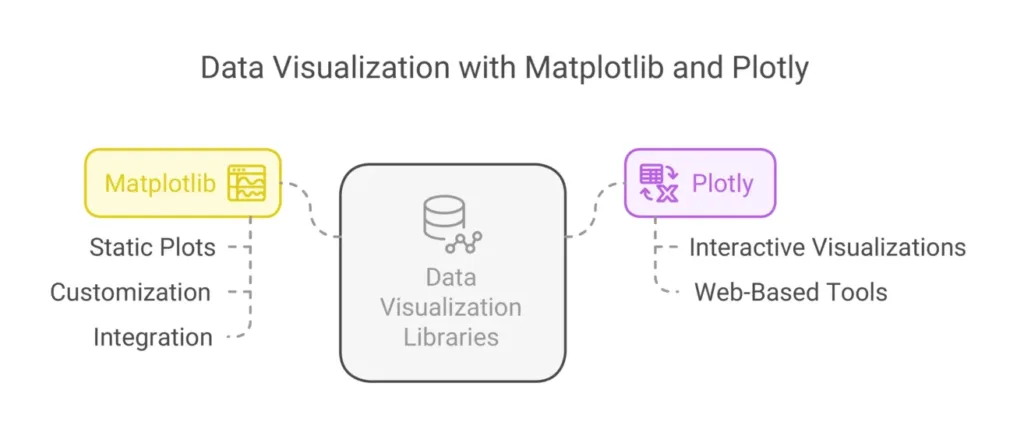
Static Plots: Matplotlib is primarily used for creating static visualizations, which can be saved as images or displayed in Jupyter notebooks.
Customization: Users can customize almost every aspect of a plot, including colors, labels, and styles.
Integration: Matplotlib integrates well with other libraries such as NumPy and Pandas, making it easy to visualize data from these sources.

Basic Data Visualization with Matplotlib
Matplotlib is a versatile library for creating static, interactive, and animated visualizations in Python.
Line Plot
A line plot is useful for visualizing the trend or relationship between two variables over time or other continuous intervals.
Example:
					import matplotlib.pyplot as plt

# Sample data
x = [1, 2, 3, 4, 5]
y = [2, 4, 6, 8, 10]

# Create a line plot
plt.plot(x, y)
plt.xlabel('X-axis')
plt.ylabel('Y-axis')
plt.title('Line Plot')
plt.show()
Explanation:
In this example, we have two lists,
xandy, representing the x and y coordinates of points on the plot, respectively. We use theplot()function from Matplotlib to create a line plot, and then customize the plot with axis labels and a title usingxlabel(),ylabel(), andtitle()functions. Finally, we useshow()to display the plot.
Bar Chart
A bar chart is useful for comparing the values of different categories.
Example:
					# Sample data
categories = ['A', 'B', 'C', 'D']
values = [10, 20, 15, 25]

# Create a bar chart
plt.bar(categories, values)
plt.xlabel('Categories')
plt.ylabel('Values')
plt.title('Bar Chart')
plt.show()
Explanation:
In this example, we have a list of categories (
categories) and corresponding values (values). We use thebar()function from Matplotlib to create a bar chart, and then customize the plot with axis labels and a title. Finally, we useshow()to display the plot.
Advanced Data Visualization with Plotly
Plotly is an interactive visualization library that offers a wide range of visualization types and customization options.
Scatter Plot
A scatter plot is useful for visualizing the relationship between two variables.
Example:
					import plotly.express as px

# Sample data
df = px.data.iris()

# Create a scatter plot
fig = px.scatter(df, x='sepal_width', y='sepal_length', color='species')
fig.show()
Explanation:
In this example, we use the
scatter()function from Plotly Express to create a scatter plot. We specify the dataframe (df) and the x and y variables (sepal_widthandsepal_length, respectively). We also color the points by the species of the iris flower using thecolorparameter.
Heatmap
A heatmap is useful for visualizing the magnitude of a variable across two dimensions.
Example:
					import seaborn as sns

# Sample data
flights = sns.load_dataset('flights')
flights_pivot = flights.pivot('month', 'year', 'passengers')

# Create a heatmap
plt.figure(figsize=(10, 8))
sns.heatmap(flights_pivot, annot=True, cmap='coolwarm')
plt.title('Passenger Counts by Year and Month')
plt.show()
Explanation:
- In this example, we use the
heatmap()function from Seaborn to create a heatmap. We specify the pivot table (flights_pivot) with rows as months, columns as years, and values as the number of passengers. We customize the plot by adding annotations (annot=True) and specifying the color palette (cmap='coolwarm'). Finally, we add a title to the plot.
In this topic, we embarked on a journey through the realm of data visualization using two powerful Python libraries: Matplotlib and Plotly. We began by exploring basic visualization techniques with Matplotlib, such as line plots and bar charts, which are essential for understanding the distribution and relationships within data.Moving on to more advanced techniques, we delved into Plotly, a library renowned for its interactive and dynamic visualizations. With Plotly, we explored scatter plots to visualize relationships between variables and heatmaps to uncover patterns across multiple dimensions. Happy coding! ❤️
